Usability
Radio Buttons vs. Dropdowns
How to decide between a Radio Button Group or a Dropdown?
In summary, prefer Radio Buttons:
- they can save clicks, and
- showing all the options mitigates wrong assumptions.
When dropdowns are OK?
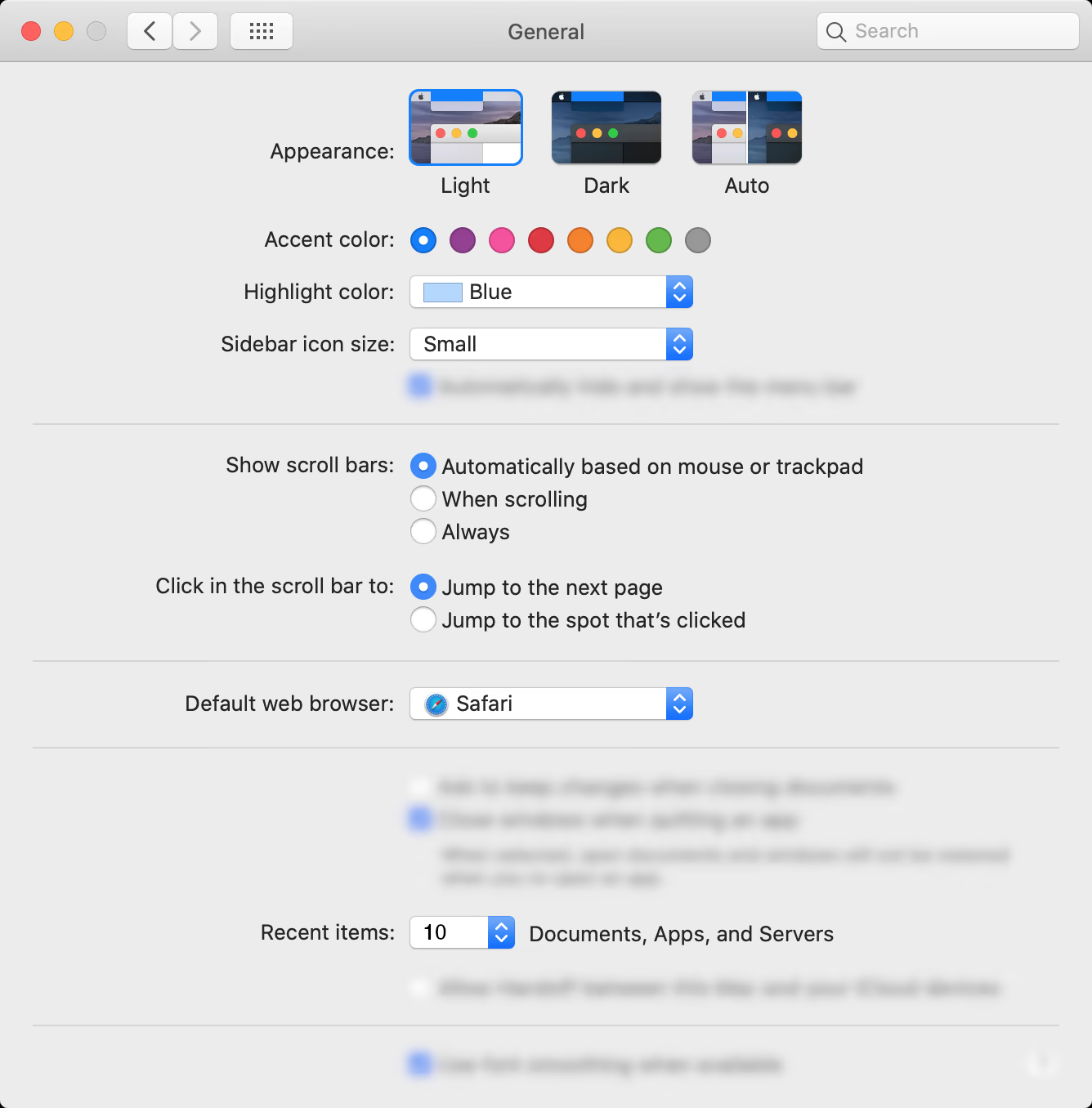
…when its hidden options are guessable. Let’s elaborate by analyzing the “General” settings of macOS®.

Appearance radio

Although the “Auto” option makes sense, it isn’t intuitive. Therefore, radio buttons are better suited regardless of being more versatile in graphic terms.
Highlight color dropdown

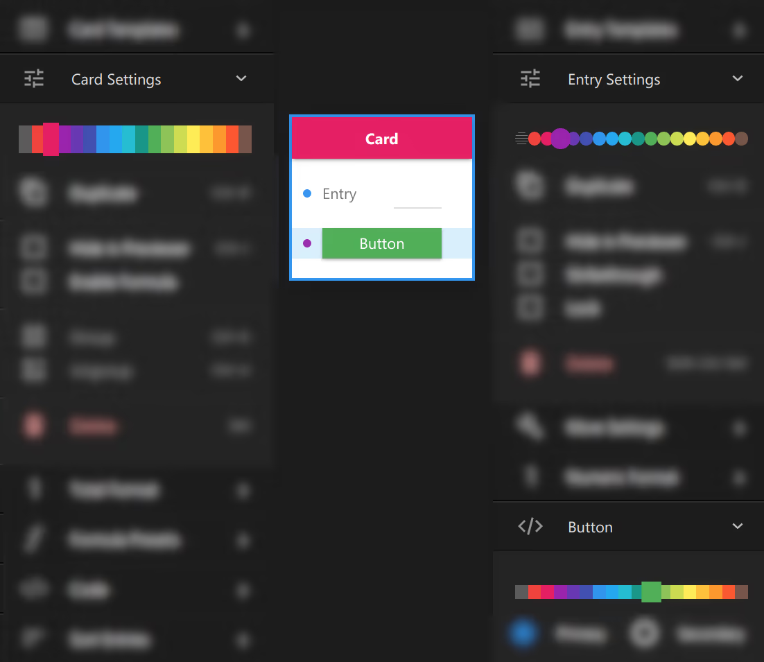
Challenge: two color pickers together.
Using named colors in Highlight color adds too much importance, so my guess is that it isn’t a radio button to avoid confusing it with more Accent colors. For example, named colors are appropriate for difficult to undo cases, such as the phone color.
As an alternative, the color pickers could be drawn in different shapes. For instance, in Uxtly all of them were rectangles and users confused the Card and Entry color pickers.

Recent items dropdown

As this is a numeric list, a discrete numeric slider would work as well. But a dropdown is fine because the hidden options are guessable.
Also, you may think it should be labeled Maximum number of recent items. But the goal is to label elements unambiguously enough.
A dropdown with default selection could be confusing
One day I was looking for cinnamon, and I ended up pouring paprika on my oatmeal.
As opposed to settings panels like above, in data entry flows, a dropdown without preselection is safer. A default option might confuse users into thinking that that’s what they have in mind. Also, it has more chance of not being read.
On the other hand, a default selection can be safe if the user expects the option and if the hidden ones aren’t needed to disambiguate the default one. For example, the size of a shirt.
Drafting Choice Groups
In Uxtly, creating Radio Buttons or Dropdowns start in the same way. For either one, use the Choice Selector template, as explained in this video tutorial.